 |
| image: ryan mat |

Thursday, 31 January 2013
INDUSTRIAL & COMPACT LOUNGE
Friday, 25 January 2013
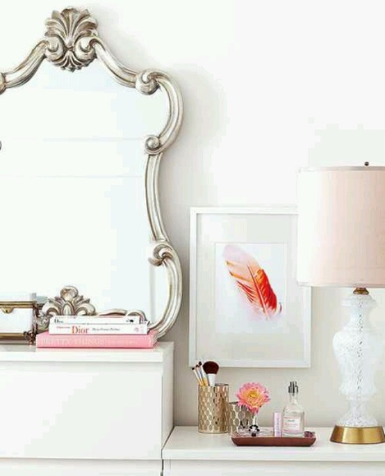
A VANITY OF PRETTINESS
 |
| image: pinterest |
Thursday, 24 January 2013
THE YELLOW BED FROM SCOUT HOUSE
 |
| image: scout house |
as much as i wanted to buy many things, we only ordered the bed, and i am grateful that my husband was willing to let me a) buy the bed; and b) buy the bed in yellow! it is available in so many colours but i couldn't move away from the yellow. adrian thinks it is quite funny that we have a bed in 'safety yellow'! i was a bit unsure whether i would love it as much as i thought i would when we actually got it home, but i was not disappointed. it is truly a feature piece in our bedroom and i love it! definitely one of my favourite pieces and definitely worth a visit to scout!
scout house
w: http://www.scouthouse.com.au/
e: hello@scouthouse.com.au
p: +61 3 9525 4343
a: 125 Grey Street, St Kilda, Victoria, 3182, Australia
Scout House is open Wednesday to Monday from 11 - 5 weekdays and weekends from 10 - 5
Wednesday, 23 January 2013
PARIS VS NEW YORK, LA FACADE
i really like the paris vs new york prints by Vahram Muratyan. He is a graphic artist from France who has spent some considerable time in New York and started visually representing the differences between the two cities. i love that the images are so simple but convey so much about each city. my particular favourite is the print titles 'la facade'. i think both cities are so easily identifiable from this image. do you agree?
 |
| image: paris vs new york |
Tuesday, 22 January 2013

Monday, 21 January 2013
COZY LIVING ROOM
 |
| image: the design files |
 |
| image: the design files |
Friday, 18 January 2013
PRETTY FLORALS


Thursday, 17 January 2013
A FEW SNAPS FROM ANNABELLE KERSLAKE'S
annabelle's home was recently featured on design*sponge. she is half of fete magazine which is a beautiful lifestyle magazine. this house has such a lovely collection of different things spanning several more traditional 'styles'...very eclectic. some of the details i particularly love are the industrial lights, the timber to bring warmth to spaces and the fine line style of images on the linen, cushions etc.
a mix of mid-century furniture with industrial lighting and fine prints...
sheepskin for softness, black and white detailed cushion, bold freehand cross and an orchid (i really would like one of those orchids!)
feminine details in the bedroom mixed with an industrial style lamp...
cute table with home grown herbs and a black and white louis style chair...
 |
| image: design sponge |
 |
| image: design sponge |
 |
| image: design sponge |
 |
| image: design sponge |
 |
| image: design sponge |
Wednesday, 16 January 2013
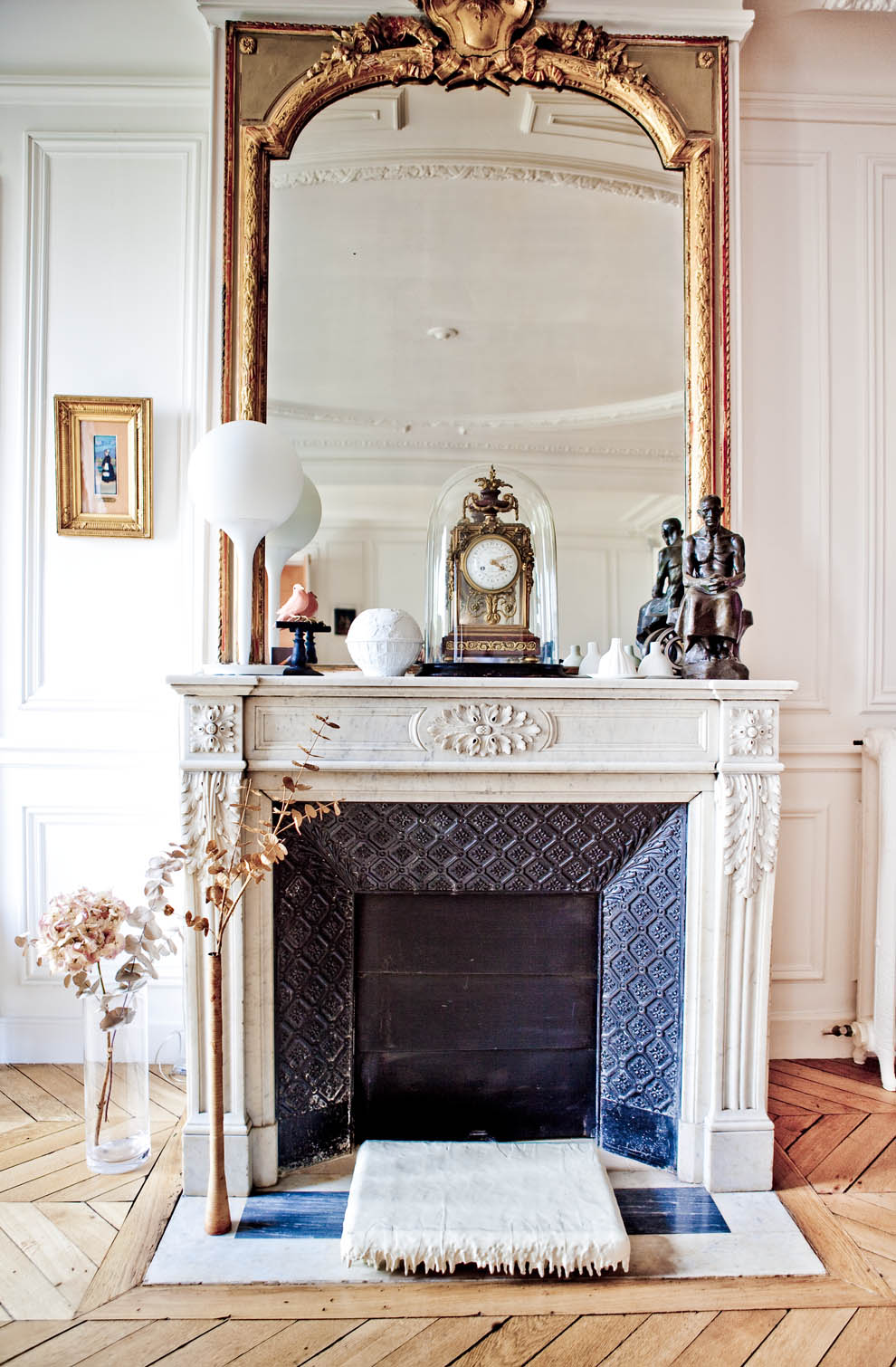
AN ELEGANT MANTLE
 |
| image: milk |
Tuesday, 15 January 2013
MILANO DUOMO
of all the churches we saw on our 2 month trip to europe in 2011, this was my favourite from an external perspective. maybe it was because we got to go on the roof but i loved the stonework and the buttresses and the repetition that could be captured. the roof of the milano duomo is beautiful and definately worth seeing. this is one of my favourite pictures that we snapped while we were there.

as can be expected with a visit to europe, there was scaffolding on the highest part of the church but for me, the highlight was the buttresses, the colour in the stone and the craftsmanship that can be observed so closely. which is your favourite church that you have come across?
as can be expected with a visit to europe, there was scaffolding on the highest part of the church but for me, the highlight was the buttresses, the colour in the stone and the craftsmanship that can be observed so closely. which is your favourite church that you have come across?
Monday, 14 January 2013
FRESH WHITE BEDROOM
 |
| image: bolig |
the trunk and the plant on the windowsill top off this image nicely.
Friday, 11 January 2013
PRINT OF A LADY
 |
| image: jessica's little shop of illustrations on etsy |
Thursday, 10 January 2013
PRETTY
 |
| image: the little corner |
Wednesday, 9 January 2013


Tuesday, 8 January 2013
RECLAIMED TIMBER COFFEE TABLE
 |
| image: milk magazine |
Monday, 7 January 2013
HOUSE DOCTOR SPRING 2013 INSPIRATION
i stumbled across 'house doctor' while perusing the decor8 blog and i love it. industrial details, type, bell jars, timber tabletops...whats not to love? unfortunately they don't have any dealers in australia but the images are lovely anyway! they have heaps of lovely things for the home, including furniture, home decor, linen, accessories, lighting etc.
 |
| image: decor8 |
 |
| image: decor8 |
 |
| image: decor8 |
 |
| image: decor8 |
 |
| image: decor8 |
 |
| image: decor8 |
 |
| image: house doctor |
Friday, 4 January 2013
BLACK & WHITE # 2
 |
| image: spicer & bank |
Thursday, 3 January 2013
BLACK & WHITE # 1
 |
| image: bright bold & beautiful |
Wednesday, 2 January 2013
COLOURS I LOVE

 |
| images: 79 ideas |
the prettiness in the first image is something also that i am drawn to, with the french style armchair, chandelier, cushion details, rug and the ceiling.
Subscribe to:
Posts (Atom)