 |
| image: 79 ideas |

Wednesday 27 February 2013
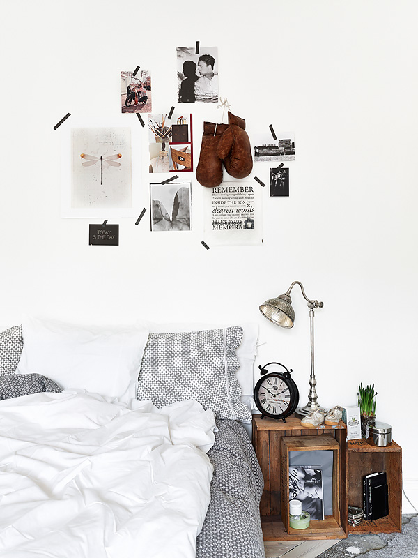
SIMPLE BEDROOM
Friday 22 February 2013
WELCOME TO OUR HOME

so this was one of my holiday projects over christmas and new year. as you walk into our house, there is a cupboard right in front of you which is now covered in chalkboard paint! the previous owners had painted in the hinges so it was painted in situ. painters tape became my friend in this project and very much saved the architrave from looking like a mess! please ignore the yellow walls - these are soon to be changed to antique white and some cole and son wallpaper!
a couple of tips if completing this at home:
- sand off gloss paint before painting - this will mean that the paint will stick to the surface.
- put some plastic down on the floor and cover it with newspaper - the newspaper will absorb the paint and prevent it from running but the plastic underneath will save you if you have a big spill
- put painters tape inside the line of the door in case the paint brush bristles slip between the door and the architrave
- a larger number of thinner layers is better than a smaller number of thicker layers - i did try to lay on the paint pretty thick but it just ends up with drips so its not worth it
- do three layers of chalkboard paint instead of two - it didn't look like the coverage was complete or even until there were three coats
- when writing on the chalkboard, map it out lightly first and then draw it in, and have a damp piece of paper towel with you to refine any mistakes.
Wednesday 20 February 2013
COZY WORKSPACE
 |
| image: design traveller |
Monday 18 February 2013
BLUE & WHITE FROM IKEA
 |
| image: home sweet home |
Monday 4 February 2013
FRENCH STYLE KITCHEN
 |
| image: daily dream decor |
1. The tiled floor. the tiling on the floor is a beautiful pattern but it works in this space because the other surfaces are not patterned so the whole image doesn't become overwhelming. The subtlety in the colours is nice as well - the same colour blue is picked up in the vase on the table and the bowl on the benchtop. This subtlety prevents the space being overwhelming with colour which it could be if the colours were loud and the tolix chairs were still teal.
2. The industrial details. In case you haven't picked up on this so far, i love a nice industrial detail in a space. I like the strong statement of the black pendant light and the vintage worn teal chairs but again they are not overwhelming as they are balanced by the white in the cabinetry and the walls.
3. The lightness. This is a combination of the beautiful natural light streaming in from the window, but also in the furniture. The steel legged dining table is beautifully detailed but doesn't sit heavily in the room.
4. The details generally. The brackets under the cabinetry, the ladder style bookcase, the open shelves near the window, the horse on the windowsill, a timber frame on the picture on the wall and the planter on the windowsill. it is the details that make a space but also reveal a little about the occupier of the space.
Essentially i love pretty much every component in this space and how they work together and have a balance. What do you think?
Friday 1 February 2013
FAIRY LIGHTS AND PICTURES
 |
| image: interiors originals |
Subscribe to:
Posts (Atom)